
A tiny strip at the bottom of a chat can carry a lot of weight. For many brands in Thailand using LINE Official Account, a LINE rich menu Thailand is where intent turns into action, or stalls.
If the menu is crowded, vague, or built around internal teams, customers drift. If it's clear, timely, and tied to the next step, people tap, book, buy, and come back. That difference is what strategy fixes.
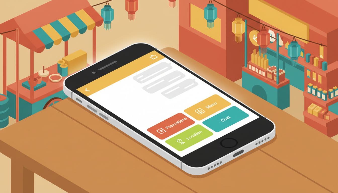
Thai consumers already use LINE Official Account (LINE OA) for daily communication, so the rich menu sits in a familiar place in the menu bar. It isn't decoration. It's the front desk inside your chat, open every time a follower lands in the conversation.
That matters because most users don't want to "browse." They want one fast move: order lunch, find a branch, claim a coupon, book a slot, or message staff. A good LINE rich menu strategy in Thailand respects that behavior. It reduces choice, then points to the highest-value action.
As of April 2026, the best practice is still simple. Keep the menu focused, mobile-first, and built around tappable call-to-action buttons that lead somewhere useful, such as booking, a product page, a chatbot flow, MyShop, or a location page. Brands also keep pairing the menu with QR acquisition, broadcasts, coupons, and chat automation, all managed via the LINE Official Account Manager. The default rich menu uses templates with layouts like the standard rich menu image dimensions of 2500x1686 or 2500x843. If you need a quick reference for current sizes, layouts, and action options, this Thailand LINE OA setup guide is a helpful baseline.
A common mistake is treating the menu like a mini sitemap. Customers don't care that separate teams own promo, CRM, store ops, and service. They care about speed.
If a button doesn't shorten the path to sale, service, or store visit, cut it.
The strongest menus start with customer intent. First, map the top reasons people open your LINE Official Account. Then, rank those actions by business value and user demand. That order should shape the layout.
Four large button templates work well when the next step is obvious, featuring prominent tap areas. Six smaller buttons fit brands with broader journeys, but only if each tap area earns its place. For design inspiration and label clarity that reflect your Brand Identity and Corporate Identity, these rich menu design tips are useful because they stress short, clear wording. Specific assets like the rich menu image are uploaded to the LINE Official Account Manager.
This quick view helps frame priorities by sector with strong call-to-action directions:
| Sector | Best buttons | CTA direction |
|---|---|---|
| Retail | New arrivals, Promo, Points, Stores | Shop now, Use coupon or reward card |
| Beauty | Book now, Best sellers, Reviews, Consult | Book a skin check |
| F&B | Menu, Order, Coupon, Nearest branch | Order lunch |
| Healthcare | Book, Doctor hours, Price, Directions | Book a visit |
| Property | Project tour, Unit types, Price, Chat agent | See available units |
| Education | Courses, Fees, Open house, Advisor chat | Talk to an advisor |
The pattern is clear. High-intent actions belong in the largest and easiest zones.
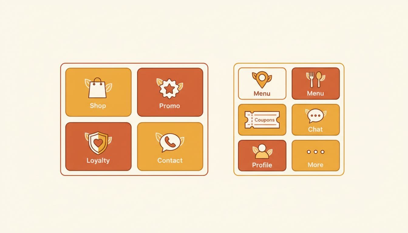
Retail brands often need a split between commerce and retention for their LINE Official Account. A strong menu might lead with "Shop," "Today's Deal," "Member Points," and "Find Store." Beauty brands usually perform better when they reduce friction around booking, consultation, and customer service. A clinic or skincare label can pair "Book Now" with "Top Products," "Reviews," and "Ask an Expert."
F&B has a sharper rhythm. Lunch and dinner windows matter, so the menu should favor "Menu," "Order," "Coupon," and "Branch." Property brands need trust and speed, so project tour, unit availability, price range, and agent chat should sit above glossy brand storytelling. Education brands often need one menu for parents and another for prospects on their LINE OA, because fees, timetable, and campus visit intent don't behave the same way.
This is also where the menu should line up with your broader Thai social media strategy. If paid media, creators, and content all push different promises, the menu becomes a dead end.
One menu for everyone is rarely the best menu. New followers need orientation. Existing buyers need service and loyalty. VIP users may need early access, exclusive deals, or a priority contact path. Many brands in Thailand now rotate menus by audience or campaign period to enable personalized marketing, using the Messaging API as the engine for advanced features like the Dynamic Rich Menu and Personalized Rich Menu, as long as current account settings and plan limits support that setup.
A practical flow looks like this: a user scans a QR code in-store or from paid media, lands in the account, taps a rich menu button, receives the right prompt or offer via a per-user rich menu, then moves into purchase or booking. That path is short, measurable, and easy to improve. To set this up technically, head to the LINE Developers Console, use your channel access token to create a rich menu object with a specific rich menu ID, and leverage auto-tag for user grouping into segments like new followers or active customers.
Segmentation logic doesn't need to be fancy at first. Start with three groups:
Then test one variable at a time. Swap the first button. Change the icon. Reduce six buttons to four. Move "Coupon" higher during payday week. Rotate a seasonal menu using a new template and rich menu image for Songkran, back-to-school, or year-end gifting. Service brands, including salons, home services, finance, and auto care, often get better results when they feature booking, quote request, branch map, and live chat before anything else, powered by the Messaging API.
Analytics matter here. Track taps by menu area, then compare that with downstream actions. If "Promo" gets taps but no purchase, the landing step is weak. If "Location" wins for healthcare or F&B, local intent is stronger than expected, so branch pages deserve more space. This LINE OA guide for 2026 also points to practical habits that still work well in Thailand, including QR distribution and basic audience tagging.
Default templates use 2500x1686 or 2500x843 pixels. Four large buttons suit obvious next steps; six smaller ones fit broader journeys if each earns its tap. Upload images via LINE Official Account Manager for mobile-first clarity.
Use Messaging API in LINE Developers Console with channel access token and rich menu ID for dynamic menus. Group users via auto-tag into new followers, active customers, or lapsed for tailored navigation like welcome offers or loyalty shortcuts.
Treating it like a mini sitemap with departmental buttons crowds it and slows users. Customers want speed, not browsing—cut anything that doesn't shorten paths to sales, service, or stores.
Track taps by area in LINE OA analytics, compare to downstream actions like purchases. Test one change at a time: swap buttons, add seasonal icons, or rotate for campaigns like Songkran, then adjust based on what converts.
Retail: Shop, Promo, Points, Stores. F&B: Menu, Order, Coupon, Branch. Beauty/Healthcare: Book Now, Consult, Reviews. Always prioritize high-intent CTAs that align with Thai user habits on LINE OA.
The best LINE rich menu strategy in Thailand is usually the least crowded one. When the menu mirrors real intent, each tap feels natural, and the chat starts doing useful work.
For brands in retail, beauty, F&B, healthcare, property, education, and services, the winning formula stays the same in 2026: keep the path short, segment with purpose, and test what earns the next action. A rich menu should move people, not merely greet them. A successful LINE OA strategy involves more than just design; tools like MAAC can help scale these efforts. Consider including an FAQ as a standard template element in the menu bar, the gateway to these high-intent actions, to improve user experience.


